September 16, 2009
A Quick Reshuffle.
I initially made this blog to upload bits of design, either that I had produced, or I thought would be of interest to other people, or even just uni related bits which held some relevance to the work I was producing, and that seems to have become lost amongst reviews and general musings about different things. So anyway, I've reverted back to my original idea and have taken out the irrelevant posts (which will appear in a new blog) and so hopefully I can continue to add to this and it can all be a bit more cohesive.
June 14, 2009
A Squawking Book of Gulls.

The last marked work of this year was done and dusted with the "10 things" brief, but since then we've been set a Souvenir brief, supposedly just a bit of fun - though I felt I could have had ample fun had I not had an ongoing project. Generally speaking I haven't worked very hard on it at all, and today is the only day really that I've actually gotten down to working hard, I was worried that I would be finished ridiculously late, but it looks like I've made good time.

Okay, so the idea behind my outcome was based in the stigma and prejudice surrounding seagulls, who seem to be despised by most of the general public. So I have put together a little souvenir book, that people arriving for a seaside holiday would be able to pick up, and within it are fun, playful (to juxtapose their mangey image) illustrations with captions to give the images context. The idea is to teach the audience to interpret seagull body language and with that gain some understanding of a creature who people deem as pesky and irritating, rather than intelligent and amusing - which my (very brief) research showed that they actually were.
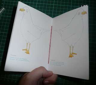
The binding was only very simple, I had too few pages to try perfect binding it, but I think it worked fairly well - in total I think I had 8 or 9 illustrations which was less than I initially intended but time constraints meant that that had to do, though I don't really think this is to the detriment of the booklet as you get a general idea of the layouts, grids and typography etc.

I kept the illustrations running throughout, and the typeface I chose because I thought it had definite seaside connotations; it works as an older, more traditional visual style to counteract the much more contemporary layouts and informative type.
A week today I will be home and my first year here in Fal will be officially over, I can't get over how quickly this year has gone! I think my last week here will be a fun one.
May 31, 2009
Beach life.
With Unit 5 finished I've found myself with a considerable amount of free time (this, of course, means disregarding the 'souvenir project' which is due in a week and a half, but y'know, good weather takes precedence). Today was baking hot, at least in comparison to the months and months of cold weather that we've had - and so it seemed fitting to leave our work behind and walk down to the beach for a barbeque.

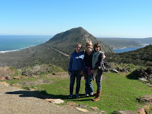
We had an abundance of sausages and it was a really great day - it makes me remember why Fal struck me as such a great place to live, I very much plan to have numerous days such as this before this term is over - I know I will miss the beach when I'm back in Surrey. I thought photographing my last couple of weeks here would nicely document a time I will look back on fondly. I really cannot believe the first year of my degree is already up.

May 30, 2009
So, its been a while.
I'd like to say I've been too busy, that there's been lots of important happenings going on but sadly no - I just forgot about this blog, too lazy to update it; so here's my attempt to rectify that.
Unit 5 is finally finished, the last piece of marked work for Level One Graphics! It really is bizarre to think I've completed a year already. So, briefly, this unit was great because it really gave us the freedom to do whatever (literally). Three initial briefs; 10 Things You Should Know About.... , Red, Blue, Green and First Things First, or Not. I chose 10 things, and within that picked famous disasters - I really wanted to avoid something disgustingly cliched like, for example; 10 things you should know about surviving an earthquake, or something equally uninspiring. My projects to date, have been fairly sensible, and really not that playful, so this time I decided to do something I would find a bit more fun.
So I wrote my own brief which gave my project the title of; "10 Things You Should Know About (avoiding) Political Disaster". I initially did a lot of research into examples, and actual politicians, but this morphed my idea into more of a fact-file rather than something satirical, or tongue in cheek - and really quite dull. So I kept away from using specific examples in my outcome, and I think this really benefited the piece.
So here is the final outcome; presented in book form and (hypothetically) designed in dossier/manifesto form to give to new or prospective leaders of political parties...

This was the front cover; I designed my own "typeface" (in the loosest definition of the word, I think) - the corrupted, worn geometric shapes were meant to mirror the breakdown of politics (supposedly). Though to be honest it was just a bit of fun doing something more "hands-on" for once.

My ten chapters.... (I tried to keep the visual theme of the red/blue throughout the book)

Just an example of a double page spread. I used two bupa-esque characters to help illustrate each of my ten chapters, I think it helped animate my book (and also cut down the amount of text I had to write).

... and again. I actually put quite a bit of effort into writing the text for each of the chapters, trying to get across the ironic, tongue-in-cheek tone of the book - though I think this is quite easy to overlook.
As the (final) final outcome of the year I am quite pleased, I rarely like my pieces after staring at them for a month of project work, but actually, now, a couple of days after the hand-in, I think my grids and layouts work quite well. I just wish I hadn't made such a hash of the binding, but oh well, you can't have everything.
March 17, 2009
The calm after the storm.
This week is review week, with the book project finally done and dusted, all the graphics students can relax, at long last! It was especially galling last week having to sit and work in the stuffy studio when it was so nice out, but this week we are reaping the rewards for our hard work. The weather is brilliant and we have been at the beach everyday since the deadline (bar Sunday, I was too busy watching England slaughter the French and signing contracts etc.) so yes anyway, a really great few days.
Yesterday we went to Xen as our graphics-end-of-term-meal-type-thing which made a nice change to the increasingly stale tins of soup/beans etc that I am living on in an attempt to not do any shopping until I go home. All the guys surprised me with early birthday presents which was absolutely lovely, I appreciated it more than I could say, it was a great evening.
 Birthday books; I am very happy with these, graphics books are so expensive, but so good. The YCN book was given to the students who the tutors felt had done best, or worked hardest, or whatever - and so for me to get one at the exhibition on Monday was really something, made all the hard work and near mental breakdown worth it. Everyone loves a bit of recognition.
Of course these guys know what I like, a baby Jack to go alongside my others. Yes, I am a closet alcoholic.
Anyway, the rest of the week is shaping up to be just as good; relaxation, beach, no work, sunny weather. What more could you want?
March 15, 2009
Post-it note type and general nostalgia.
It really is a scary prospect that my 2nd term at Falmouth Uni is essentially over, the time really has flown. So here I thought I'd put up some of the work I did during the first term. Generally speaking, I'm never 100% satisfied with my finals and always wish I have more time to refine them further but what can you do.

This was the typeface I created for a three week project; we were each given an anonymous questionnaire and from that discern a/multiple characteristics from which we could produce some sort of graphic outcome. I think I took nostalgia, forgetfulness and similar such attributes. I was actually quite pleased with this, but thought it looked better forming actual words, which I did have some images of, somewhere, but they're lost in the depths of my hard drive so you'll have to take my word for it.
March 11, 2009
"Bookworm" has a whole new meaning.
 Today is the day before our book-binding deadline, well, the deadline for the books themselves anyway. If it turns out our sketchbooks are in for tomorrow too I might as well just throw myself off a cliff and be done with it.
So today, I have been (trying) to make my final book, after more mock-ups than I care to remember and an obscene amount of prep work I felt it should (should being the operative word) come together smoothly. Oh no, that would be far, far too easy. In essence today has been a big, sticky, paper-wasting mess. I don't even know if I am happy with my design anymore; my cover is off-center and I'm scared to open the book should it all fall apart - so yes, today has been pretty grim.

All I can say is thank goodness tomorrow it will be over. Though having said that, the content for this project was enough to keep me interested for the four weeks, which is more than can be said for the previous "languages matter" brief.
I suppose with these photos some sort of explanation regarding my book is required, well tough, I have had more than enough of it, I am sick of it.

Good times.
Subscribe to:
Posts (Atom)